MAKING YOUR BOOK LOOK GREAT
As a writer you will eventually reach a stage in your work where you are ready to place the words ‘the end’ upon the page and reflect with satisfaction at your completed book After many months of hard work and dedication the hard part arrives of handing it over to someone else to review and edit, I know some self-publishing authors will just send it straight to market due to budgetary restrictions, but they run the risk of publishing a book with errors. You will also find that an editor will be able to point out any areas where improvements could be made; this type of ‘fine-tuning’ separates the great from the good
So with your book being edited and proof read (all of which will take time) your next task will be to ensure your book has the cover it deserves, and this should be a book cover design which will enable it to stand head & shoulders above its rivals upon the book shelf.
Some will try the route of making the book cover themselves, again this is something that you can see both good and bad examples upon the pages of Amazon, people will swipe an image off of the internet (not understanding the copyright issues with both the image and the font they’ve used) and then haphazardly stick it together. The fact is, people do judge a book by its cover, we judge everything by the way it looks (just think of the millions which go into advertising and its research), if your books cover looks amateurish then I am afraid to say your audience will jump to the conclusion that its contents are the same and will quickly move on to the next book.
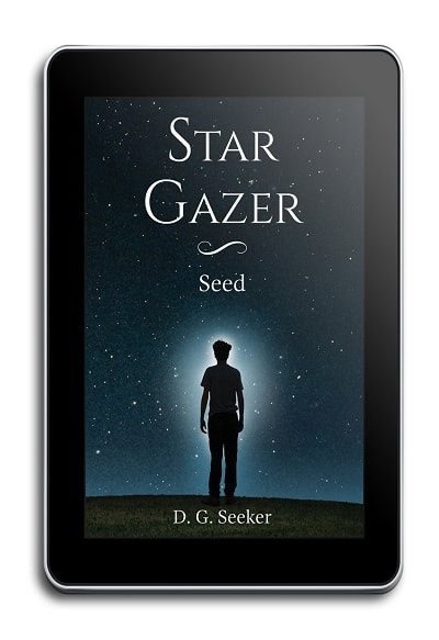
With the cover for a book which is going straight to eBook publication then the book cover design will be technically quite straightforward, it will need to be made in the RGB colour model and 1500 x 2400 pixels in dimension (most will also specify 72 ppi although there are some eBook stores which will want it higher).
So with your book being edited and proof read (all of which will take time) your next task will be to ensure your book has the cover it deserves, and this should be a book cover design which will enable it to stand head & shoulders above its rivals upon the book shelf.
Some will try the route of making the book cover themselves, again this is something that you can see both good and bad examples upon the pages of Amazon, people will swipe an image off of the internet (not understanding the copyright issues with both the image and the font they’ve used) and then haphazardly stick it together. The fact is, people do judge a book by its cover, we judge everything by the way it looks (just think of the millions which go into advertising and its research), if your books cover looks amateurish then I am afraid to say your audience will jump to the conclusion that its contents are the same and will quickly move on to the next book.
With the cover for a book which is going straight to eBook publication then the book cover design will be technically quite straightforward, it will need to be made in the RGB colour model and 1500 x 2400 pixels in dimension (most will also specify 72 ppi although there are some eBook stores which will want it higher).
|

|
One of the main things to bear in mind however with the design of an eBook cover is its size when on display, what may look fantastic when at full size can look at little lost when it’s shrunk down to the size of a postage stamp (for use with the books thumb nail). You want the books title to be read at the smaller size but not to the point where the books design is completely lost because of the font size either.
The image and design of the cover will obviously vary depending upon the books contents and the needs of the author, but a well-designed book cover should enable the potential reader to grasp the concept of the book within a fraction of a second, the design should ensure the work stands out upon the book shelf and draws the reader back to it. Choice and use of colour will play a major role here too, with selective use of the colour wheel colours can complement one another and lead to a design which doesn’t clash or becomes too noisy for the viewer.
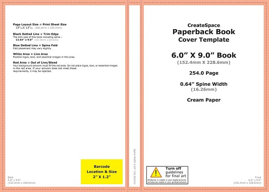
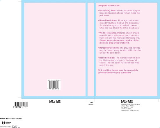
When you look at a cover for a printed book then unless you have the time, patience and money to spend on the required software it’s easier to hire a professional. Most books which will be printed are normally done so using an ‘off-set’ printer, this is where four ink plates are used to make up the image of your book cover, these inks are Cyan, Magenta, Yellow and Black (otherwise known as CMYK – the K referring to Black). When you design a cover to be printed you’ll need to ensure that the design is created in the CMYK colour model, the design itself will need to be delivered to the printer as a ‘Print-Ready PDF’, this means that any layers are flattened, that the font you use with the design is embedded, that the work has bleeds (for when they trim the book) and as stated before, that it’s in CMYK.
The image and design of the cover will obviously vary depending upon the books contents and the needs of the author, but a well-designed book cover should enable the potential reader to grasp the concept of the book within a fraction of a second, the design should ensure the work stands out upon the book shelf and draws the reader back to it. Choice and use of colour will play a major role here too, with selective use of the colour wheel colours can complement one another and lead to a design which doesn’t clash or becomes too noisy for the viewer.
When you look at a cover for a printed book then unless you have the time, patience and money to spend on the required software it’s easier to hire a professional. Most books which will be printed are normally done so using an ‘off-set’ printer, this is where four ink plates are used to make up the image of your book cover, these inks are Cyan, Magenta, Yellow and Black (otherwise known as CMYK – the K referring to Black). When you design a cover to be printed you’ll need to ensure that the design is created in the CMYK colour model, the design itself will need to be delivered to the printer as a ‘Print-Ready PDF’, this means that any layers are flattened, that the font you use with the design is embedded, that the work has bleeds (for when they trim the book) and as stated before, that it’s in CMYK.
|
|
Some printers will also limit the ink levels used within your design down to 280% or 240% (depending upon who you use), you will need to keep this in mind if your printer requires this as it can affect the look of the design, however, if you set the levels prior to starting work you can still ensure a great result.
But don't worry, If you have any questions about a book cover design please feel free to get in touch with us.
But don't worry, If you have any questions about a book cover design please feel free to get in touch with us.