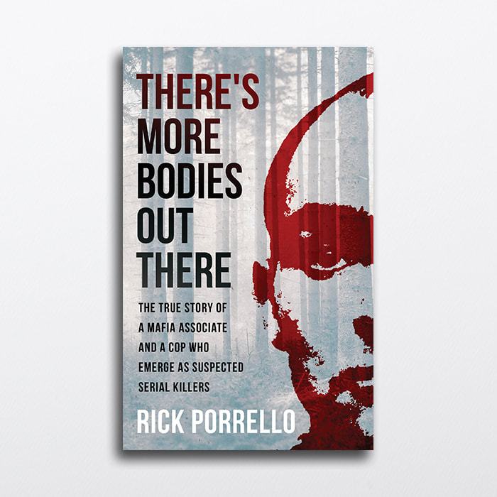
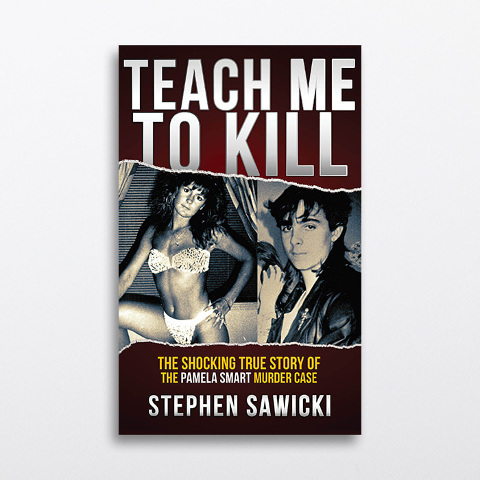
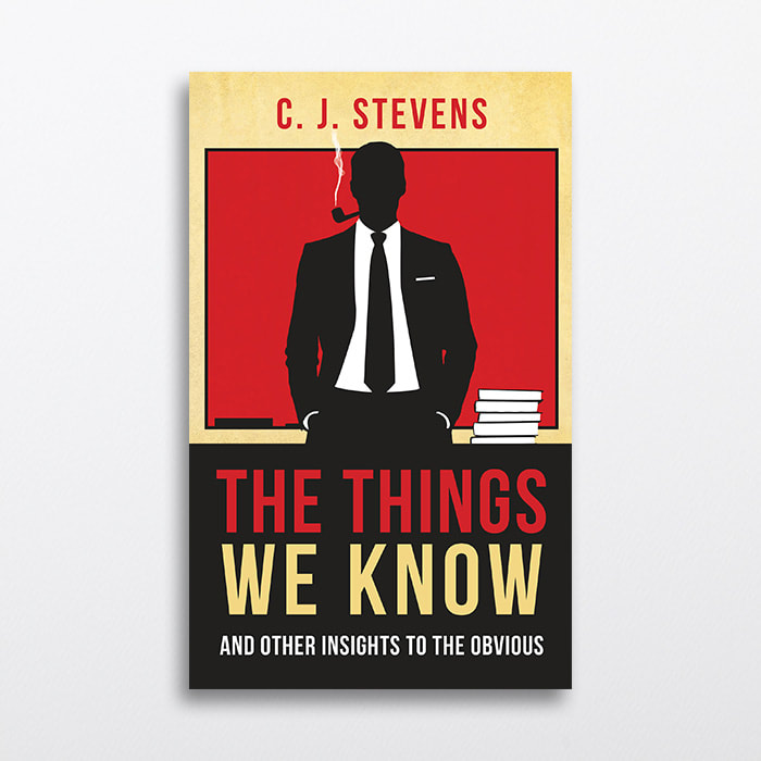
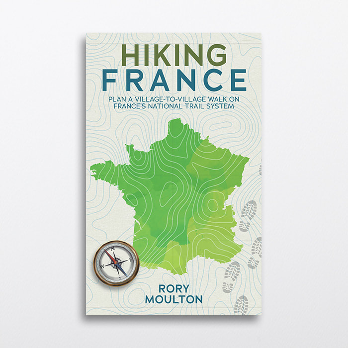
NON-FICTIONAL BOOK COVER DESIGN
Transform your nonfiction book into a masterpiece with our exceptional book cover design service.
Our team of talented designers will work closely with you to understand your vision and create a custom cover that grabs attention and conveys your message effectively.
From compelling typography to striking imagery, we ensure every element harmonizes seamlessly to entice potential readers, elevate your book's professional appeal and boost its chances of success, with a professional non-fiction book cover design from the experts.


Please check your Spam folder if you don't see a response from us within 48hrs
What goes into a book cover design?
|
Nonfiction and its representation in terms of book design is one which differs from that of the fictional novel, this is something which may come as no surprise to the writer, they have an understanding that the reader of non-fiction is of course looking for something very different to draw from the book itself.
So when it comes to the design of the nonfictional book cover there are elements which need to be considered, here I look at some of those which we consider when working with any non-fiction writer, admittedly, some are similar to things we ask of our fictional authors (you still need to have a thorough understanding of what the book’s about!). |

|
1) An understanding – In order to accurately represent the concept and message of the book, you need to have a clear understanding as to its contents and message. This will come from either reading the entire book (time and workload permitting) or thoroughly questioning your author. Getting a clear grasp on what needs to be represented is vital and your number one goal before you put pencil to paper.
2) Mixing messages – Unlike that of the fictional book a nonfictional cover won’t normally be full of explosions or beautiful models looking thoughtfully off into the distance, you need to remember that the cover gives the potential buyer a first impression as to its contents, if your book is a serious one then it needs to show this, too much drama and you run the risk of confusing the reader.
3) Keep it clean – A bold message upon the front cover usually requires clean lines and the use of negative space, this enables your eye to be drawn to the focal point of the book and give a fair representation of its contents.
4) Symbols – Symbolism in the design of nonfiction enables you to get a message across in a very powerful way without the blurring of lines between fiction and non. However, symbolism won’t work with every book cover, if you’re designing a cover for a cook book then you’ll normally find that an image of one of the recipes is far more appealing.
5) The book’s title and text – Possibly one of the most important aspects of your nonfictional cover, most nonfictional book covers tend to be text-heavy, what I mean by this is that the title is a very prominent aspect of the design itself. Again, with the use of clean lines and negative space you can ensure that the title jumps off of the page to the viewer, this is important when working with a book which has a longer title. The font you choose is also incredibly important (we’ve dedicated a page to font selection in our Writer’s Room), even shifting from serif to sans serif (in the same font family) will have a dramatic impact to the design. Serif tends to work better with titles of a more serious nature and serif with lighter books, you will find that slab-serif can work for both depending upon the font you choose for the sub-title and author’s name.
6) Viewable font – Following on from font selection is understanding how your font will look when the book is upon the screen of the online store, you need to remember that the book will get resized to something similar of a postage stamp (so it needs to stand out). Choosing a cursive font may look great when printed as a full size book but gets lost upon the screen, choose the wrong color and the font will get lost completely and no one will be able to read your title. Contrast between background and text will help, this married with a more prominent font will ensure your book still looks professional and is readable at a glance.
7) Contrast – Most authors tend to sell their work via Amazon and as such will be aware of the way in which Amazon displays their work upon the page, as mentioned prior, it does get resized and along with this displayed upon a white background. Having a completely white cover works very well in print but it will get lost when being sold online. Using contrast here via darker elements within the cover will help you to overcome this issue.
Creating a design for nonfiction is incredibly rewarding, you can still create outstanding designs which inspire and most importantly capture both the attention and imagination of the viewer. Have a clear understanding of your brief and using the guidelines mentioned above will ensure a great cover and a happy author.
For your Non-Fiction book cover design, get in touch with us today