|
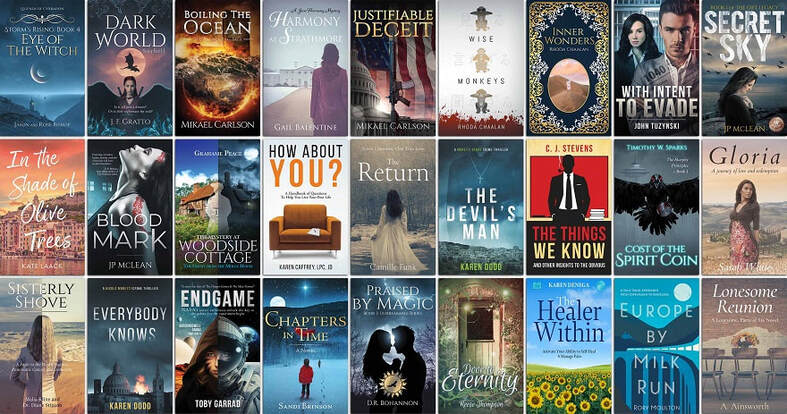
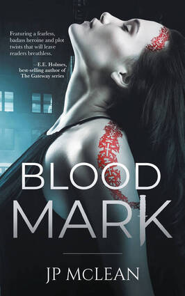
When you create book cover designs for self-publishing authors, you get to work with a lot of very creative people, which is always an enjoyable experience, taking the synopsis for their book and developing a cover design which is something that we love to be involved with. Over time we have created countless book covers for all genres and for print on demand services such as KDP Publishing, IngramSpark, Lulu and many others (both big and small). When creating a cover there are things that we look for, in the design, layout and requirements of both the project and the required format (whether that’s in print as a paperback or hardback, or as just an eBook cover design). You’ll also find that the print on demand service being used will also have different specifications for the book too. So, here are some of our favorite book covers with a little detail on what went into the design and where you can find the book too. In The Shade of Olive Trees This book was published in November 2022 by the author Kate Laack. The book cover design features the location of the setting within the storyline, using warm and softer tones and hues to allude to the content within, the copy for the title is bold and clear to read, but again, within a softer and handwritten style. The lighting shows the sunrise just about to come up, which hints at a brighter future for the characters within the book and this sits well within the author’s chosen genre. Blood Mark Book published in September 2021 by the author J.P. McClean For this book the storyline is a lot darker and focuses in on the main character of the book, the cover puts this character front and center, showing off the strange marks upon her shoulder and forehead, you also notice that the letter K in the title is partially made up off a dagger, again, this hints at the darker subject within the book. The font is a bold type, with a subtle gradient leading from the base upwards, again, this is to ensure that the reader understands the genre and that it is clearly read. The Tome of Wyrms Book published in March 2021 by the authors Jason and Rose Bishop This book is a fantasy novel, and the book cover design makes that quite clear, the setting features a mystical book (or tome) placed upon a medieval style desk, you see the dagger, papers and other trinkets which point to the location and setting. The colors are still warm (with the fire of course in the background), but there is also darkness to the edges of the cover, again to set the scene for the genre and to ensure that the title (which uses a more ornate/thinner font) is clear to read. You also can see quite clearly that this is part of a series and that readers will have other editions that they would be interested in too. Everybody Knows Book published in June 2021 by the author Karen Dodd A bold scene in the lower portion of the cover design, it shows an explosion with a ball of flames rising above the roof tops of a European town. The font used is bold and very contemporary, this is to help set the time/era of the story, the dark clouds above the city hint at the danger within this crime thriller. With the use of shading, clouds, the explosion and font choice, it is very clear what genre this book belongs to, and when upon the bookshelf it catches the eye of the reader very quickly. Black & Blue Book published in September 2020 by the author Patricia Oakey This is a bold and distinct book cover design, published via KDP Publishing, and it works very well in both print and in eBook alike. The cover focuses in very closely upon the main character’s face, you see just a portion of it with great detail being given to the woman’s very blue eye. The light is very subtle, with the skin tones being brought out and other areas being left in the dark, and for a crime thriller this is very apt. The font choice is contemporary and bold, this ensures it is easily read and helps to place the era of the book. Say Cheese and Murder Book published in October 2020 by the author Michelle Pointis Burns An illustrated book cover design for a novel within the cozy thriller genre, this features a waiter’s hand and arm holding a tray of both cheese and Champagne (the glove and jacketed arm hinting at the era set within the book). The font used is softer, this is to help the reader know that the book is not a hard/dark crime thriller, you’ll also see that the border and embellishments are luxurious and upon a golden background, again, all to build up the setting of the story. Justifiable Deceit
Book published in February 2022 by the author Mikael Carlson This book is set within the genre of political thrillers and the cover makes that very clear from the get-go, the design features a background of Capitol Hill, the Flag of the US, and then very bold in the foreground is an automatic rifle. There is a great use of light and shade to highlight the darker elements within the story and allowing for the title to standout even more, this font has been adapted to have a gold sheen to it and give it a more powerful look.
0 Comments
Your comment will be posted after it is approved.
Leave a Reply. |
JD&JCategories
All
Archives
July 2024
All information within this website (including its blog) is published in good faith and for general information purposes only. JD&J Design LLC does not make any warranties about the reliability and accuracy of this information. Any action you take upon the information in this website is strictly at your own risk. JD&J Design LLC is not liable for any losses and/or damages in connection with the use of this site and information.
|

