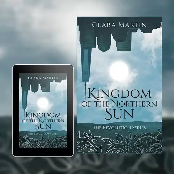
If you’re an author who is about to embark upon the creation of a book cover design, you’ll have started to research designers, the process and maybe even the thought of creating a cover yourself, and the more you look into it the more confusing it can seem. So, what are the basics that you should be aware of as you get a cover made (or try to make one)? The first thing to ask is as to where you’ll be selling the book, most authors will choose both eBook and print, as such you’ll need book cover designs for both mediums (and there is a difference between the two). Because the two options for publication are different to each other we’ll look at them separately, starting with eBook design. eBook cover design So, what should you be aware of with regards to an eBook cover? Well, first of all the dimensions will vary depending upon who is publishing your eBook. For example, KDP publish their eBooks for Kindle as 1600 x 2561 pixels, whereas Lulu will size their eBook covers to 612 x 792 pixels (which is more square in its appearance when compared to KDP). The second element to consider is the color profile, unlike the majority of print, eBooks use the RGB color profile. RGB stands for Red, Green and Blue and is known as an Additive color model, this is something specific to screens and provides a wider range of colors. The third element will be the resolution of the image itself, now most screens operate at 72 dpi/ppi (dots per inch – a printing term or Pixels per inch – for digital) but you will find that this can lead to a more blocky image, so we tend to create our eBook covers for 300 dpi/ppi, you’ll also find that many eBook publishers will ask for it to be at 300 dpi/ppi anyway. Finally is the file itself, the overwhelming majority of eBook covers are created as JPEGs and normally between 2MB – 10MB in size. Printed Book Cover Designs Printed book cover designs are very different to the way they are set up in comparison to eBooks, the first thing you’ll find is that the color profile will normally be with CMYK, Cyan, Magenta, Yellow and Black. CMYK is a subtractive color profile, when your book cover design is printed it will be done using four plates (Cyan, Magenta, Yellow and Black) together making the colors of the design. Unlike RGB It’s subtractive in that the less of each individual color plate you add the lighter the overall color becomes, the downside to CMYK is that the color range itself is smaller than RGB, so you will find some limitations as to the vibrance of colors. Sticking with CMYK for a moment, you will also find that some printers (such as Ingram Spark) will also place restrictions upon the amount of ink that can be used within your design, for example, if you wanted a rich black color you would print 100% on all four plates (C=100%, M=100%, Y=100% & K=100%), however, when you try to print like this is can cause smears and issues within the printing process. So, to ensure a clean print there may be restrictions of having a maximum of 240% ink across all four plates (so your rich black now becomes C=0%, M=0%, Y=0% & K=100%), this isn’t as deep a black as before but will ensure a clean print. Next is the size of your book, this is compiled of several elements, the front and back page, the spine and the bleed areas. Now most people will understand the back page, front page and spine, but the bleed areas (unless you’ve published before) may be new to you. The bleed area is a strip 0.125in wide which runs around the four outer edges of the book cover, when the book cover is trimmed these outer edges get cut off, now because the image upon the cover extends into these bleed areas when the design is trimmed to size you will not have any white lines running on the outer edges of your book. You can see the trim line and bleed area on the outer edges of all four sides of the design below, it's along this dotted line that the book cover will be cut and those outer edges removed, this ensures a clean and professional finish. The size you choose to print your book as will depend upon your genre, page count, audience and preference, you can find more details on trim sizing from our article ‘Understanding Trim Sizes’
The fonts you use within your design will also need to be embedded when you export (or save) your design, basically when you send your cover to a printer and they don’t have the fonts used upon it within their system then it will have issues trying to print. So, the PDF should be created with the fonts you want upon the cover actually embedded into it, when the printer goes to use the design, the fonts are with it and everything prints as it should. Most Adobe software will allow you to export with the fonts used embedded, and this is pretty much as standard (so it is easier to do than you may at first think). The resolution for printed book covers will always be at a minimum of 300 dpi, this keeps everything clean and sharp for the cover. When you come to save/export your book cover you’ll do so as a PDF, again, this will ensure that the fonts are embedded and that the profiles are set for printing, most printers will require you to export as PDF/X-1a:2001 (this you’ll find as a setting within the export options when doing so) and to ensure that you export without any printers marks. So, there is more to preparing your cover design for both digital and print than you may have at first realized, both options have some limitations but both also enable you to create great designs which will make your book look amazing too.
0 Comments
Creativity in writing, design, art, music and any form of expression will always be at the forefront of the discipline, it’s where new ideas, new paths, new ways of looking at the world and the leading edge of your chosen art form lie. But like ‘Writer’s Block’, struggling for creativity can happen (and has happened to many artists). However, most blocks are just temporary, caused by trying to force something and a lack of patience, this leads on to panicking that you’ll never complete what you’re working on and the spiral continues. But there is hope, as mentioned, it is just temporary and sometimes the best thing to do is to simply stop for the day. It’s so beneficial to rest and get back to it after a good night’s sleep (it’s surprising how much differently you look at what you’ve just created/worked on after 24hrs). There are many ways to get back in to your creative flow, all of them are easy to do and maybe just a combination of a couple will get you back on track. One – Get up and get out A lot of creativity happens while in a stationary environment (writers, painters, designers etc.), you need to get up and get the blood flowing in your veins. Go out into the fresh air and go for a walk, run or bicycle ride, the change of environment, fresh air and exercise all help to stimulate your creativity (and it helps to maintain a healthy lifestyle, a true win-win). Two – Rest As mentioned at the beginning, creativity needs concentration and focus, nether of these can you bring if you’re completely tired. A good night’s sleep is vital to creativity, being alert and well rested is a must if you want to be productive. So, make sure you get 7 to 8 hours to quality sleep each night (ditch the cell phones while your lying in bed, they really don’t help). Three – Get inspired Whatever your chosen art form, seek inspiration from its giants, this maybe reading classic novels, going to an art gallery, watching a movie or visiting several websites. Observing what the best have done can breed inspiration. Four – Push past your comfort zone Doing something that initially scares you builds confidence and forces you to think creatively, it could be public speaking, joining a group, a new sport, trying a new art form, promoting your book to publishers or selling your art at a craft fair (the list is endless). Of course, make sure what you’re about to do is safe and appropriate, but pushing your boundaries is a great way to increase creative thinking. Five – Clear your mind Sometimes overthinking can be your worst enemy, if you’ve never tried it before consider meditation, this centuries old practice is used by millions of people around the world today and some of the most successful creatives swear by it. Give it a try, there are hundreds of instructional videos on YouTube to show you how, it’s so much easier than you think and you don’t have to be sat cross legged by a waterfall either! Six – Free write Free writing can be as simple as doodling and jotting down thoughts and daydreams, there’s no pressure, no agenda and no right or wrong outcome. Just grab a pad of paper, pencil or pen, relax and see where it takes you. Seven – Have a routine Knowing when you are at your most creative is something that many don’t give thought to, it may be that you work best at 5am or you could be fired up and ready to create at midnight (it’s different for everyone of us). But YOU will have an understanding of what works best for YOU, so try to plan your routine to exploit your strength, it may not always be possible to do this for every day, but you should be able to plan for at least two days of each week. Eight – Practice Regardless of how good you think you are, you still need to practice, the leaders in any field of art became leaders through thousands of hours of dedication and practice, if you want to be great you need to put the hours in. Nine – Learn new skills
We live in an age where all the information you could ever want is just at your fingertips, but do you utilize this? Whatever your chosen artform is, there is always something new to be learnt, a new skill to be attained and an existing one to be polished and mastered. There are lots resources out there, but websites such as Udemy is brilliant for this, if you don’t want to spend any money then YouTube can also be a good resource too. Ten – Work with others Working with other people within your field can be scary (especially if you normally create alone), but it can also be inspirational. It gives you an opportunity to learn and forces you to raise your own game, working with others exposes you to different ways of creating and looking at the world. As Dorian continues its path up the East coast of the USA we count our blessings in Florida, we watched it on the news updates and prepared, luckily we only caught the outer bands as it shifted further East, but our thoughts and prayers go out to the people affected by it. The Bahamas have taken the brunt of the hurricane with towns flattened, lives taken and the islands changed dramatically for many months and even years to come.
Now as it hits the Carolinas and continues further North we expect to see further disruption and damage, people prepare as best they can but the loss of power and damage to property leaves huge clean-ups and repairs ahead of them. As it hits the mainland It’s still hard to take in what has happened to the Bahamas, Dorian lingered as a category 5 Hurricane over their islands for many hours, the latest report shows that over 30 people tragically lost their lives due to the storm, we pray that this figure doesn’t go up in the coming days, but there are still hundreds of people missing. Right now they (and everyone else effected by the storm) need our support, they need food, water, shelter, help rebuilding and supplies, so what can we all do? The American Red Cross are collecting donations to aid those effected by Hurricane Dorian, please see their website https://www.redcross.org and donate whatever you can. Our thoughts and prayers go out to everyone effected by Dorian. |
JD&J
Book cover designers. Archives
February 2021
CategoriesAll information within this website (including its blog) is published in good faith and for general information purposes only. JD&J Design LLC does not make any warranties about the reliability and accuracy of this information. Any action you take upon the information in this website is strictly at your own risk. JD&J Design LLC is not liable for any losses and/or damages in connection with the use of this site and information.
|