|
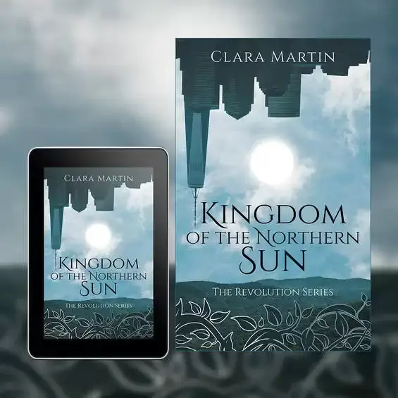
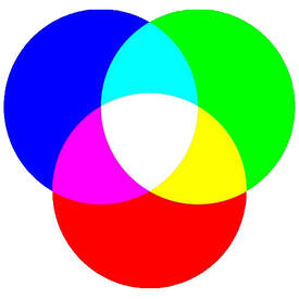
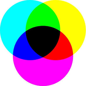
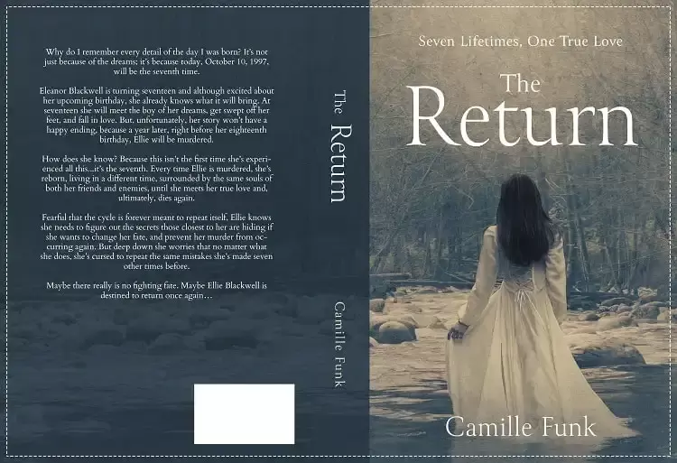
If you’re an author who is about to embark upon the creation of a book cover design, you’ll have started to research designers, the process and maybe even the thought of creating a cover yourself, and the more you look into it the more confusing it can seem. So, what are the basics that you should be aware of as you get a cover made (or try to make one)? The first thing to ask is as to where you’ll be selling the book, most authors will choose both eBook and print, as such you’ll need book cover designs for both mediums (and there is a difference between the two). Because the two options for publication are different to each other we’ll look at them separately, starting with eBook design. eBook cover design So, what should you be aware of with regards to an eBook cover? Well, first of all the dimensions will vary depending upon who is publishing your eBook. For example, KDP publish their eBooks for Kindle as 1600 x 2561 pixels, whereas Lulu will size their eBook covers to 612 x 792 pixels (which is more square in its appearance when compared to KDP). The second element to consider is the color profile, unlike the majority of print, eBooks use the RGB color profile. RGB stands for Red, Green and Blue and is known as an Additive color model, this is something specific to screens and provides a wider range of colors. The third element will be the resolution of the image itself, now most screens operate at 72 dpi/ppi (dots per inch – a printing term or Pixels per inch – for digital) but you will find that this can lead to a more blocky image, so we tend to create our eBook covers for 300 dpi/ppi, you’ll also find that many eBook publishers will ask for it to be at 300 dpi/ppi anyway. Finally is the file itself, the overwhelming majority of eBook covers are created as JPEGs and normally between 2MB – 10MB in size. Printed Book Cover Designs Printed book cover designs are very different to the way they are set up in comparison to eBooks, the first thing you’ll find is that the color profile will normally be with CMYK, Cyan, Magenta, Yellow and Black. CMYK is a subtractive color profile, when your book cover design is printed it will be done using four plates (Cyan, Magenta, Yellow and Black) together making the colors of the design. Unlike RGB It’s subtractive in that the less of each individual color plate you add the lighter the overall color becomes, the downside to CMYK is that the color range itself is smaller than RGB, so you will find some limitations as to the vibrance of colors. Sticking with CMYK for a moment, you will also find that some printers (such as Ingram Spark) will also place restrictions upon the amount of ink that can be used within your design, for example, if you wanted a rich black color you would print 100% on all four plates (C=100%, M=100%, Y=100% & K=100%), however, when you try to print like this is can cause smears and issues within the printing process. So, to ensure a clean print there may be restrictions of having a maximum of 240% ink across all four plates (so your rich black now becomes C=0%, M=0%, Y=0% & K=100%), this isn’t as deep a black as before but will ensure a clean print. Next is the size of your book, this is compiled of several elements, the front and back page, the spine and the bleed areas. Now most people will understand the back page, front page and spine, but the bleed areas (unless you’ve published before) may be new to you. The bleed area is a strip 0.125in wide which runs around the four outer edges of the book cover, when the book cover is trimmed these outer edges get cut off, now because the image upon the cover extends into these bleed areas when the design is trimmed to size you will not have any white lines running on the outer edges of your book. You can see the trim line and bleed area on the outer edges of all four sides of the design below, it's along this dotted line that the book cover will be cut and those outer edges removed, this ensures a clean and professional finish. The size you choose to print your book as will depend upon your genre, page count, audience and preference, you can find more details on trim sizing from our article ‘Understanding Trim Sizes’ The fonts you use within your design will also need to be embedded when you export (or save) your design, basically when you send your cover to a printer and they don’t have the fonts used upon it within their system then it will have issues trying to print. So, the PDF should be created with the fonts you want upon the cover actually embedded into it, when the printer goes to use the design, the fonts are with it and everything prints as it should. Most Adobe software will allow you to export with the fonts used embedded, and this is pretty much as standard (so it is easier to do than you may at first think). The resolution for printed book covers will always be at a minimum of 300 dpi, this keeps everything clean and sharp for the cover. When you come to save/export your book cover you’ll do so as a PDF, again, this will ensure that the fonts are embedded and that the profiles are set for printing, most printers will require you to export as PDF/X-1a:2001 (this you’ll find as a setting within the export options when doing so) and to ensure that you export without any printers marks. So, there is more to preparing your cover design for both digital and print than you may have at first realized, both options have some limitations but both also enable you to create great designs which will make your book look amazing too.
0 Comments
Your comment will be posted after it is approved.
Leave a Reply. |
JD&JCategories
All
Archives
July 2024
All information within this website (including its blog) is published in good faith and for general information purposes only. JD&J Design LLC does not make any warranties about the reliability and accuracy of this information. Any action you take upon the information in this website is strictly at your own risk. JD&J Design LLC is not liable for any losses and/or damages in connection with the use of this site and information.
|


