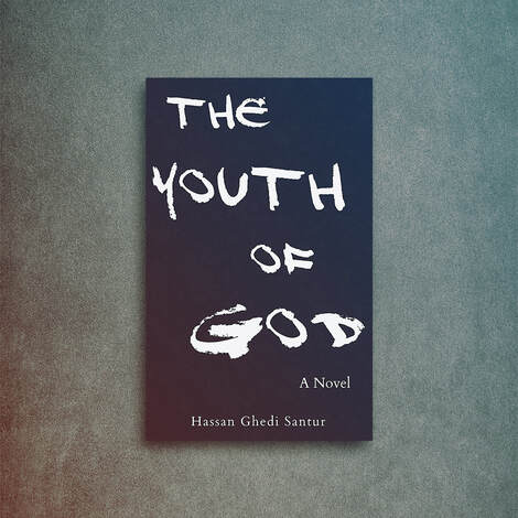
 We all judge books by their covers, it’s human nature to do so and why advertising works so well on us, after all, if advertising didn’t work, then all of the products in your local supermarket would be in plain packaging (it would be far cheaper for the manufacturers). But advertising, packaging and book design works because it targets our emotions, there’s a saying in sales that ‘you don’t sell the steak, you sell the sizzle’, because if you advertised just a raw steak it appeals less favorably to our senses than the same steak just cooked, still sizzling and on a plate ready to be eaten, think of the last TV ad you saw for any major restaurant to confirm their method, you’ll also see the same in banner ads on line and in print too (and for every product). So, having a plain book cover with just the title upon doesn’t work, or does it? Well, in some cases (and when done right) it can work, the issue is that the bookstores are incredibly crowed, and every publication is shouting loudly to be heard, so in order to stand out from the crowd, doing what is different can actually work. However, being plain for the express reason of cutting corners and costs normally leads to a book cover design that won’t work hard enough for the author.
Remember, the express goal of your book cover design is to sell the book. When you look in a bookstore at the rows of front pages, think of how long you spend viewing each one, now think of how long you spend looking at book covers when browsing through Amazon’s bookstore, because it’s a lot less time (and this is where the majority of your sales will normally come from). Your book cover will be either dismissed or accepted by the viewer within a fraction of a second, if it doesn’t look professional the viewer will make the same judgement call about the inside matter and very quickly move on to the next title. 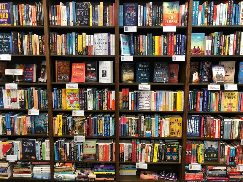 A professional design for the advertising of your book isn’t just for the wish list, it’s a must if you want to compete in bookstores (both online and in the real world). Your book cover design will need to project a message to its intended audience, you’ll need to ensure that it’s appropriate for its genre, has impact and relevance for the book itself. A lot to ask in one image but it is something that book designers achieve over and over again. Understanding the genre is important, specific genres will normally adhere to specific styles of design for advertising, this is because of our relationship and association to certain elements. For example, if you place an image of a sword within a cover the association will be with violence, fantasy, fiction etc. On the flip side, if you were to place an image of flowers then the mood swings to romance, love, passion, peace etc. Being aware of our association to elements and their link to the messages you want to say about the book is important, this is something that most designers spend hours brainstorming when working upon the drafts for a new book cover design. Along with these specifics within the design are the colors chosen for the cover, this can seem a little obvious (if you see lots of pink you may assume it’s either a romance or ‘chick lit’). However, there are psychological reasons for color selection. This is something that advertisers know only too well and use all of the time, for example, using the color red encourages excitement, passion, danger, decisiveness. Whereas black represents sophistication, security, power, elegance. The colors chosen for a book cover have a far deeper meaning than you may realize and should be chosen wisely.  Once you know what colors, subject matter and elements which need to go into the cover, you should also consider how much you place within the design. As mentioned earlier, your cover will only have a split second to grab the reader’s attention, but there is always the temptation to fill the cover with lots of detail about the book. You will need to condense the focal point of the book down to one or two elements, trying to tell the entire story upon the front page will lead to a design which becomes overcrowded, when in doubt, leave it out. A great cover design will help sell your book, but remember, there is a lot more than just putting a title upon a stock image, with thought and creativity you can have a great design which promotes your work and catches the eye of your reader.
0 Comments
Your comment will be posted after it is approved.
Leave a Reply. |
JD&J
Categories
All
Archives
July 2024
All information within this website (including its blog) is published in good faith and for general information purposes only. JD&J Design LLC does not make any warranties about the reliability and accuracy of this information. Any action you take upon the information in this website is strictly at your own risk. JD&J Design LLC is not liable for any losses and/or damages in connection with the use of this site and information.
|