|
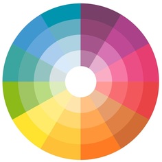
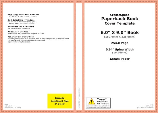
When working with some authors you’ll find that their choice of publisher will vary from what may feel like the established (or routine) print on demand services, this to some degree is bought about by the fact that Amazon and their Createspace publishing wing have such a prominent position within the industry. From the perspective of the author the only focus will be upon the return on investment, weighing up the positive and negative points of each service and going for what they feel is the better option. On one hand the ease of use and cost effectiveness with Createspace attracts many but its restriction to Amazon alone turns some towards the likes of Ingram Spark, you’re still in with Amazon but your book’s distribution is then opened up to more avenues of sale. You’ll also find that when you step away from the giants within the print on demand world you’ll pay to get your book published, you may even be hit with fees if there are any errors with your publication too. However, from a design perspective there are differences and restrictions when working with the various publishers that an author may not consider, color models which you can use within the design will alter along with variations on paper type and even margins & bleed sizes. Most of the printing services will use templates in which they’ll want the artwork and typeface to sit, the design gets created as a PDF within this template and then uploaded to their website ready to be used with the author’s book. The bigger publishers usually have a template generator where you can input the details of the cover and then download as a PDF, PNG or in some cases even an InDesign file (which is incredibly useful). These templates become the base layer for each design that the artist works upon (for printed books that is), where the publisher is smaller and doesn’t use a template you’ll find that InDesign works well in creating a base layer to work upon (Photoshop does the same however you’ll need to be precise whilst setting up the layout and using guidelines).  Color models are the other element that a designer will need to check whilst working with a publisher, for the majority of printing services the most common option will be a straight forward use of CMYK, but not all printers are the same, with some you may even find restrictions with ink levels (Ingram Spark and Lightning Source reduce theirs to 240% which can make colors seem a little flat). On the flip side, Createspace allow the designer to create a cover in RGB, this is a larger color model and as such lends itself well to more vivid colors. Most publishers will want the design as a print ready PDF which is flattened, has fonts embedded and is a one piece design with the back page on the left leading into the spine and then front page with bleed areas on all four sides. There are exceptions to this though, Barnes & Noble’s self-publishing wing ask for book cover designs to be just the front and back pages, they then create the spine for the author (which can lead to artwork being covered and in some cases a mismatch of type from front to spine). But whichever self-publishing service you choose the key is in doing your research and weighing up what you actually need for the book itself, whether you’re going for a specific market place as a seasoned professional author or just dipping your toe in with your very first eBook, whatever the situation there is a service to suit your needs.
0 Comments
Your comment will be posted after it is approved.
Leave a Reply. |
JD&JCategories
All
Archives
July 2024
All information within this website (including its blog) is published in good faith and for general information purposes only. JD&J Design LLC does not make any warranties about the reliability and accuracy of this information. Any action you take upon the information in this website is strictly at your own risk. JD&J Design LLC is not liable for any losses and/or damages in connection with the use of this site and information.
|


