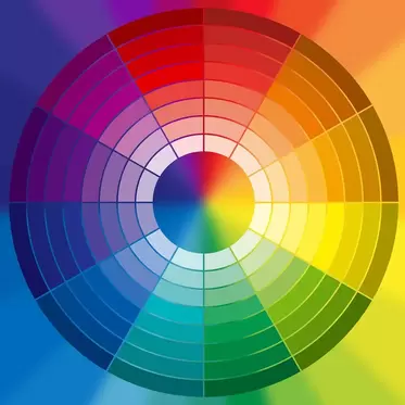
Choosing the right colors for your book cover designIn the world of book cover design, color is a powerful tool that can instantly captivate a reader's attention and convey the essence of a story. The careful selection and harmonious use of colors can evoke emotions, set the tone, and leave a lasting impression. In this blog post, we delve into the realm of color theory and its application in creating captivating and meaningful book covers. Understanding Color Theory Color theory is the study of how colors interact with one another and how they affect our emotions and perceptions. It consists of three primary components: the color wheel, color harmony, and color psychology. The Color Wheel At the heart of color theory is the color wheel, a visual representation of the relationships between colors. It consists of primary colors (red, blue, and yellow), secondary colors (green, orange, and purple), and tertiary colors (created by mixing primary and secondary colors). By understanding the color wheel, you can choose colors that naturally complement each other, leading to visually appealing book covers. Color Harmony Color harmony involves the skillful combination of colors to create a balanced and visually pleasing composition. There are various color harmonies, including complementary, analogous, triadic, and split-complementary. Complementary colors, located opposite each other on the color wheel, create a strong contrast that can draw attention. Analogous colors, found next to each other, provide a harmonious and cohesive feel. Triadic colors offer a balanced yet vibrant palette, while split-complementary colors strike a balance between contrast and harmony. Color Psychology Colors evoke emotions and associations, making them a crucial aspect of conveying the mood and themes of a book through its cover. For example:
Applying Color Theory to Book Cover Design Genre and Audience Considerations: Different genres have associated color palettes that can help immediately convey the book's category. Research your target audience's preferences and expectations to align with their tastes. Visualizing Themes and Emotions: Identify the key themes and emotions of the book. Choose colors that resonate with these elements to create a powerful visual connection between the cover and the story. Contrast and Hierarchy: Employ color contrast to guide the viewer's eye and highlight essential elements, such as the title and author's name. A well-chosen color combination can enhance hierarchy and readability.
Cultural Sensitivity: Colors can carry cultural meanings that vary across different societies. Be aware of these associations when designing covers for international audiences. Testing and Iteration: Create mock-ups and gather feedback to ensure that the chosen color scheme effectively conveys the intended message and resonates with readers. In the realm of book cover design, color theory is an invaluable tool that can shape perceptions, evoke emotions, and create an immediate connection between readers and the stories within. By mastering the principles of color theory, designers can craft book covers that not only catch the eye but also resonate deeply with the essence of the written word. So, as you embark on your next design journey, remember that colors are your palette of emotions and expressions waiting to be painted onto the canvas of literature. Also read: How to create a paperback book cover design for KDP
0 Comments
Your comment will be posted after it is approved.
Leave a Reply. |
JD&JCategories
All
Archives
July 2024
All information within this website (including its blog) is published in good faith and for general information purposes only. JD&J Design LLC does not make any warranties about the reliability and accuracy of this information. Any action you take upon the information in this website is strictly at your own risk. JD&J Design LLC is not liable for any losses and/or damages in connection with the use of this site and information.
|


