|
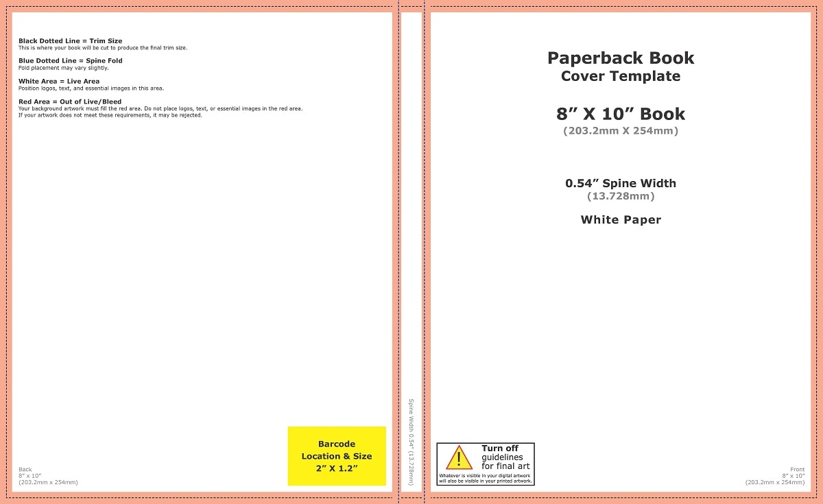
Book cover design and advertising for your novel has never been so important to any author, we all know that ‘Indie’ (or self) publishing has become easier than ever and that getting a book to market can be done in a matter of hours. With this ease to market comes greater competition for every single author and as such taking a business-like approach to the launch of your book is vital. So, when we look at the book cover design itself we have to understand that it has a very important job to do for you, along with the obvious task of looking nice, telling the reader the author’s name, the book’s title and subtitle of course, your book cover design is the advertising and ‘face’ of your work, get it right and you will catch the eye of your reader (catch their eye and you increase the chances of selling more copies). The book cover does need to follow some basic rules in its design and layout, now normally we’re all against such things as being sticklers to the rules (as we like to think outside of the box and so on), but with a book cover it does need to follow some basic principles. For example, a book cover design without the title or authors name anywhere upon it will confuse your reader, you will also need to have the layout in a specific format to fit the book itself (this can also require using a certain color profile for eBooks and another for the printed version). Technically there are elements which must be completed in a certain way in order that your book cover design works out in the real world of publishing, there are also other elements which should be taken in to consideration with your design too, these are basic elements which give your reader an idea as to the book’s content. Here the rules become a little less rigid and your creativity comes into play, but you still need to consider some basic messages which will stop any confusion, the reader will want to know from the cover design several very basic things at least, these will be the genre and if it’s fiction or nonfiction. From this point you move on to other elements that can help the reader, the era of the book, the location, the time-frame of the book and most importantly the ‘hook’. The ‘hook’ is an important element from within the manuscript which draws the reader to look closer at your book, it’s what makes someone pick it up in the store to read the back page. This has to draw the reader in but without giving too much of the books conclusion away, it can be symbolic (think of most self-help book covers and you’ll see what I mean) or it can be an element within the story such as the main character or focal point. When you further break book cover design into genres you can find that your reader ‘expects’ to see certain things upon covers, if you search for books on fantasy then you will find a trend with the types of covers on display, then same goes for crime, thrillers, romance, historical and pretty much anything else available. However, following trends too closely will not ensure that you have a book cover which stands out to the masses, you want your book cover to tell a message (and quickly too) but it needs to both represent your work professionally and be unique. The guidelines within book cover design and publishing will help to get a cover which technically works, but it’s when you get creative with the ‘art’ within the design, then you appeal to your readers, then your book has a great cover.
0 Comments
Your comment will be posted after it is approved.
Leave a Reply. |
JD&JCategories
All
Archives
July 2024
All information within this website (including its blog) is published in good faith and for general information purposes only. JD&J Design LLC does not make any warranties about the reliability and accuracy of this information. Any action you take upon the information in this website is strictly at your own risk. JD&J Design LLC is not liable for any losses and/or damages in connection with the use of this site and information.
|


