|
If you are self-publishing a book, then you will have most probably decided upon launching with eBook, paperback and maybe even hardback (with Amazon’s KDP launching this format recently, more authors are choosing casewraps to go along with paperback edition). However, with the rise in popularity of audio books, it is well worth considering an audio edition of your publication too. The good news is that you don’t have to have a recording studio, or even be prepared to read your book in its entirety yourself, Amazon’s ACX service gives you everything you’ll need to hire and prepare a great sounding audio book, you can read a full article on how to create an audio book, which should help. But when it comes to the book cover for your audio, there are some differences that you need to be aware of and prepare for. The most common versions of your book’s cover design will of course be for eBook and paperback, here you have a rectangular front page which transfers from one to the other without too much of an issue, however, you do have to take into account the resolution and (for some print on demand publishers) color management of the design. But with your audio book cover, the layout goes from a rectangle to a square, and this can be a bit more tricky to recreate from your printed/eBook cover design. ACX make the following technical requirements for audio book covers:
Along with those tech requirements, you also have the following requirements for the artwork:
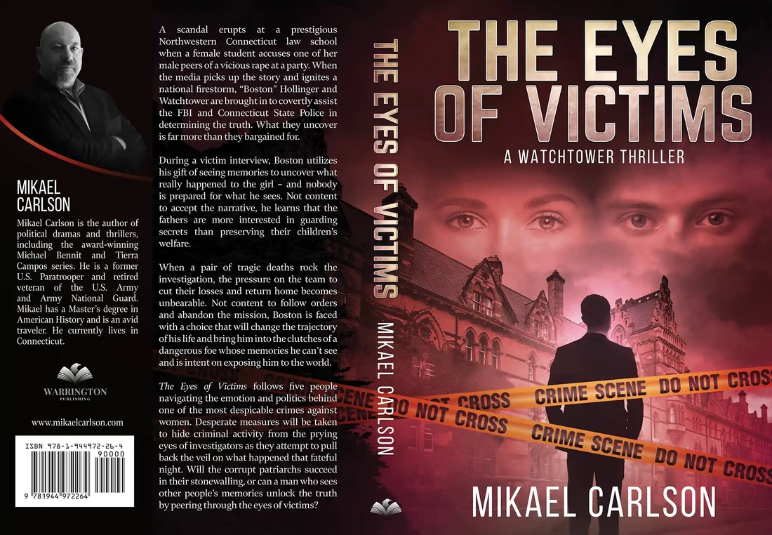
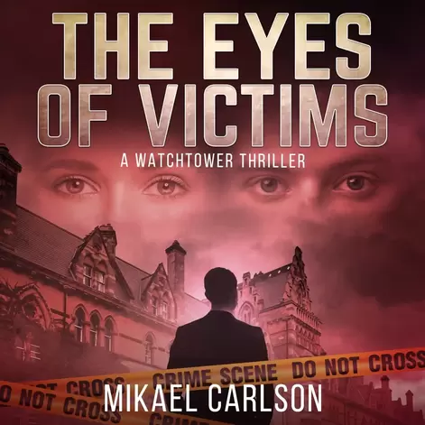
So, there are some things that you’ll need to take into account with your audio book’s technical aspect, but the most important one (as mentioned prior), is the change in shape, from rectangular to square. If you look at the book cover we created for the author Mikael Carlson, the printed edition is laid out for both paperback and eBook, it gives plenty of room for the title, author name and artwork for the cover itself. When we created the audiobook version of this, the key elements of the artwork, title and name are still very prominent, but now the layout has been adjusted for a square format. The same goes for the book Null Warden by Charles Brass, with the original printed version of the book cover there’s more room for the artwork. But with the audio, the artwork still contains the most focal elements, and the text now also includes the name of the narrator as well as the authors (again, leaving room in the right bottom corner). The main thing to remember with your book cover, is that there will be a difference between the audio book cover and the printed/eBook design, so when book cover is being created, it’s always good to let the designer know if you are planning for an audio version at a later point, this way the design can be created so that future adjustments still retain the important elements of your cover.
0 Comments
Your comment will be posted after it is approved.
Leave a Reply. |
JD&JCategories
All
Archives
July 2024
All information within this website (including its blog) is published in good faith and for general information purposes only. JD&J Design LLC does not make any warranties about the reliability and accuracy of this information. Any action you take upon the information in this website is strictly at your own risk. JD&J Design LLC is not liable for any losses and/or damages in connection with the use of this site and information.
|


