|
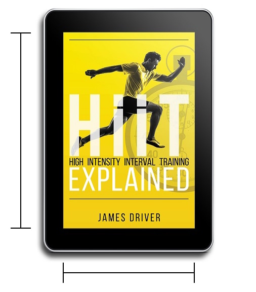
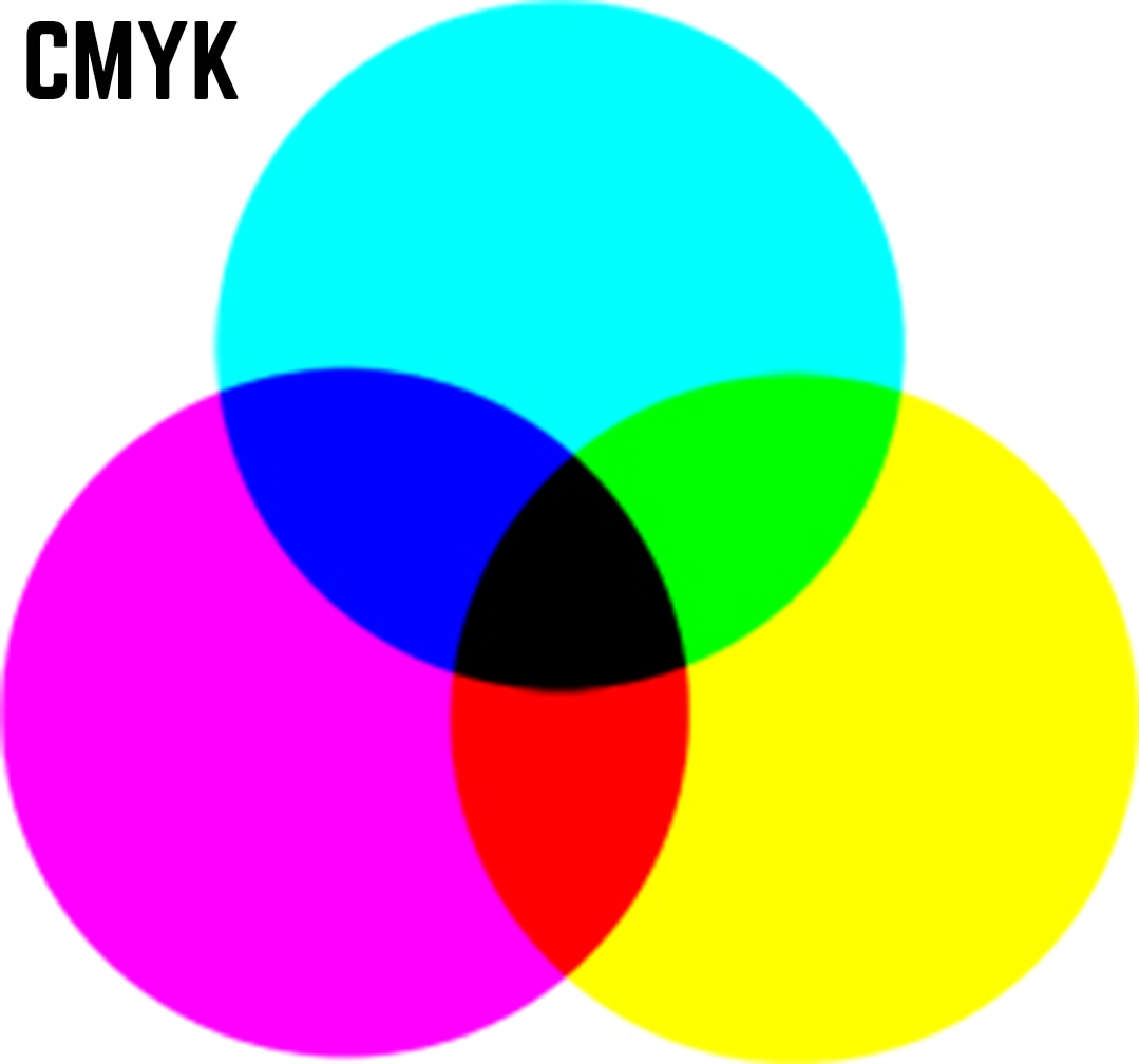
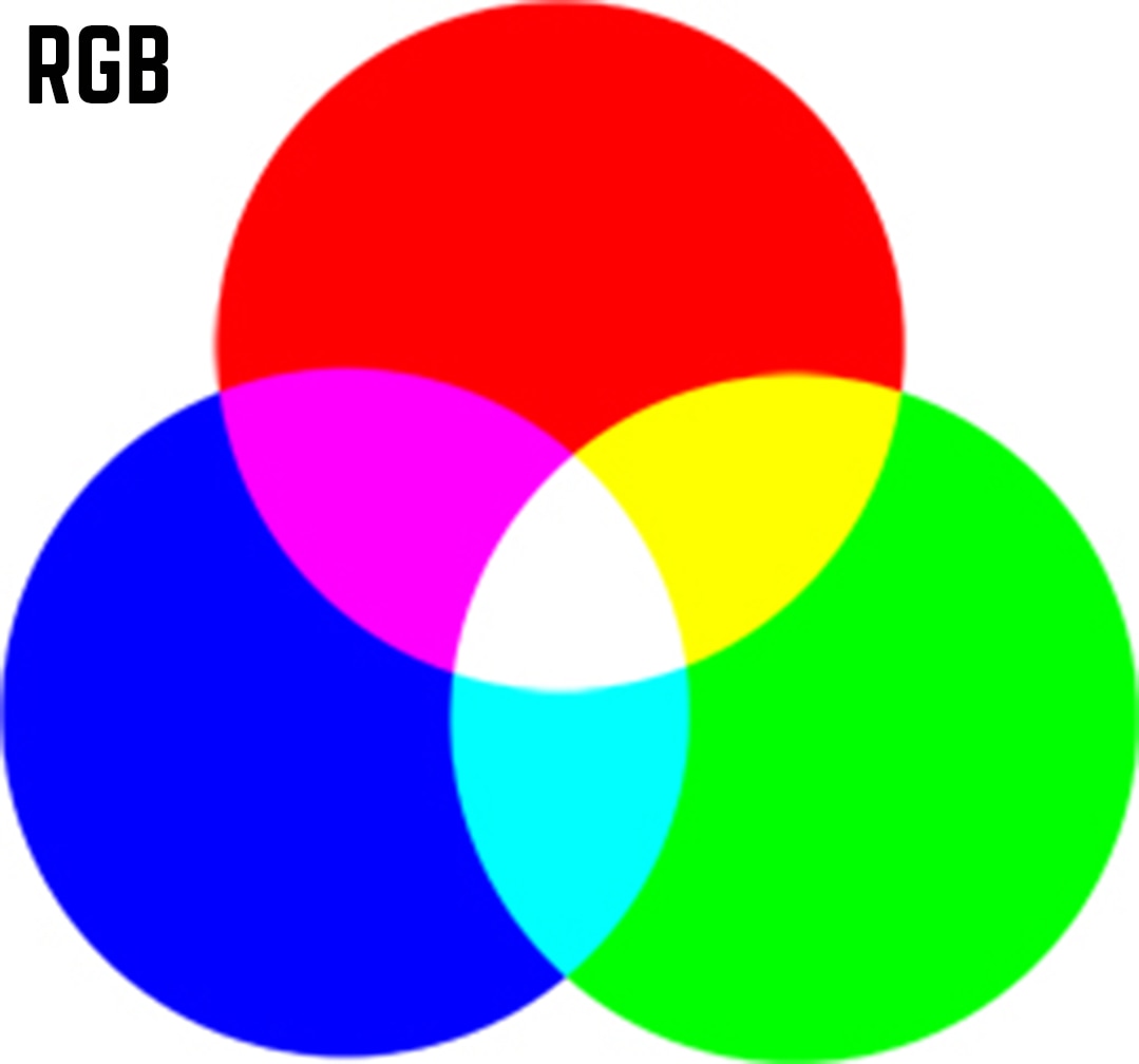
Book cover design for eBooks will have a variation on Paperbacks and Hardbacks for several obvious reasons, but if you’re new to book design then you may not necessarily know the different elements that need to be considered, resolutions between print and digital are different and there are even restrictions within the color you use in the design with many publishers too. Of course eBooks need to work on many different devices and screen sizes, with people choosing to read upon tablets, kindles, cell phones and even laptops, the book itself needs to be formatted in either EPUB or MOBI (or both if you’re launching your eBook via several platforms), but your cover design will normally be created as a JPEG. When it comes to creating a book cover design for an eBook the first ‘practical’ thing you should consider is the size, most eBooks vary slightly from publisher to publisher and what fits with one may be cropped for another, but if we look at the most popular eBook publishers you can see their requirements for the sizes of the cover. Amazon’s KDP (Kindle Direct Publishing): Amazon recommends using a ratio of 1.6:1, this translates as for every 1000 pixels wide the image is you go 1600 pixels high, they also recommend that the image should have a height of 2500 pixels (their ideal specifics are 2560 x 1600 pixels) Barnes & Noble: This book store and online retailer recommend the longest side of your cover be 1400 to 2000 pixels with the shorter side proportional, they except both JPEG and TIFF formats. Smashwords: Your file must be uploaded to them as either a JPEG or PNG file with a minimum width of 1400 pixels, their ideal size is 1600 x 2400 pixels. Apple iBooks (Bookbaby): All images can be either TIFF, JPEG or PNG files with the width at least 1400 pixels and a height to width ration of 1.5, they recommend using a size of 1400 x 2100 pixels. Lulu: They recommend using an image with the following dimensions 612 x 792 pixels and as a JPEG Once you know the size of your eBook cover you should consider the resolution of the image itself, for most printed books the cover will be designed at 300 dpi (dots per inch) this is to ensure that the image is sharp once printed, however with an eBook the image will be displayed digitally, most screens only display at 72 ppi (pixels per inch) so if you create a cover at 300 dpi the extra resolution won’t be shown and only increases the file size, so most eBook covers are designed at a resolution of 72 ppi. After size and resolution comes the actual color model you use to design the book cover in, within design there are two popular color models that are used, CMYK & RGB. CMYK is used within printing and stands for Cyan, Magenta, Yellow & Black, it uses these four colors in various amounts to make the color within your picture, by adding more of each color together the paper below loses more light and is why it’s known as a subtractive process. RGB (Red, Green & Blue) is used more within digital design (it’s known as an additive process, as when all the colors are added together to their full extent you make white). So, for the design of an eBook cover you should always use RGB for the color. Remember, practical elements for an eBook cover design are:
0 Comments
Your comment will be posted after it is approved.
Leave a Reply. |
JD&JCategories
All
Archives
July 2024
All information within this website (including its blog) is published in good faith and for general information purposes only. JD&J Design LLC does not make any warranties about the reliability and accuracy of this information. Any action you take upon the information in this website is strictly at your own risk. JD&J Design LLC is not liable for any losses and/or damages in connection with the use of this site and information.
|

