|
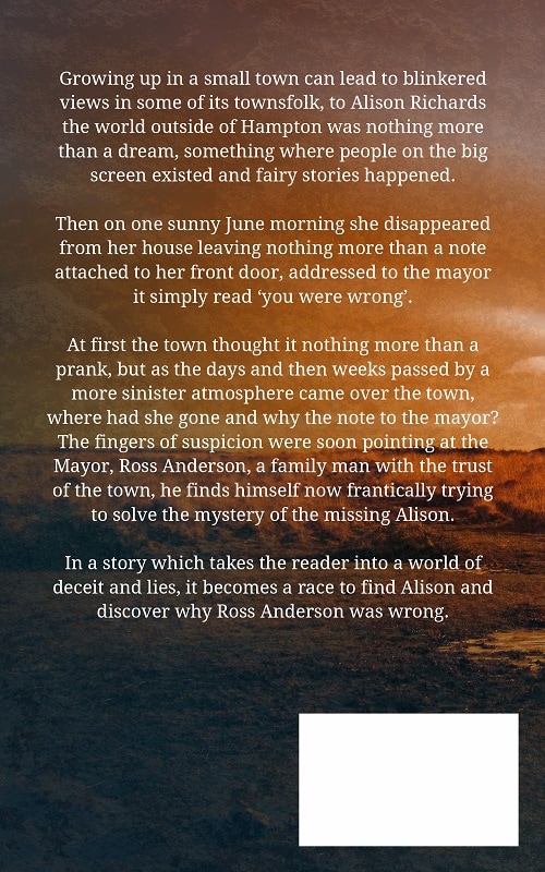
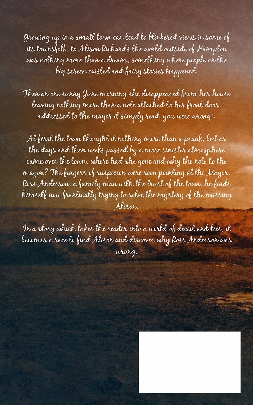
A book cover is more than just the image or illustration which goes into it, the font which is used plays a larger and more integral role than the average person realizes, it lays the foundation for the initial perception of the viewer’s understanding of the book’s concept itself, as such the font used on any book needs to be selected with care. When designing a book cover the font chosen needs to perform many jobs for the author, it should of course tell the reader what the title, subtitle and author’s name are along with the blurb, bio and (in some cases) quotes/testimonials upon the back page too. This is the basic information that needs to be upon the cover in order that the reader gets the relevant information. However, this information (especially what’s on the front page) will give the viewer an idea as to the genre and book’s contents quicker and more succinctly when the correct font is used, when you look at the examples below, you can see that the first example uses a font which lends itself well to a book within the fantasy genre whereas the second version uses a sans font that leads to a confusing finish to the cover design. The use of a sans font lends itself better to non-fiction and children’s book, however, when a sans font is used in uppercase then it can work very well in fiction, as a bold and block sans this type can give a dramatic feel to the copy on the front cover and make a bold impression instantly. You also have the choice of script and cursive fonts to use upon the book cover, these work very well for use as titles, subtitles and author names but shouldn’t really be used as the font for the book’s blurb and bio, the cursive font when reduced in size and as a body of 200 to 300 words makes it very difficult to read. When you are choosing a font for the blurb and bio, then either a sans or sans serif is a better choice, if you make it easy for your viewer to read the copy you stand a better chance of them doing so. Once you have a book cover design created then you may be faced with an image which has many aspects to it and so the placement and choice of font needs to take in to account how easy it will be to read, with the example below you can see that the bold font matches the style of cover and at the same time is easy to read, the second design uses a font which indicates its fiction but is so narrow that it gets lost within the background of the book cover design. The correct selection of font is integral to the book cover design and should always be considered when developing the cover, you can of course add to the font with various tools within Photoshop and InDesign, this means that it becomes even more embedded within the cover (and not simply an afterthought). You should always place as much importance on font selection as you do the actual design, do this and you’ll get a cover which is both balanced and professional.
0 Comments
Your comment will be posted after it is approved.
Leave a Reply. |
JD&JCategories
All
Archives
July 2024
All information within this website (including its blog) is published in good faith and for general information purposes only. JD&J Design LLC does not make any warranties about the reliability and accuracy of this information. Any action you take upon the information in this website is strictly at your own risk. JD&J Design LLC is not liable for any losses and/or damages in connection with the use of this site and information.
|


