|
We all understand that a great book cover design is essential when it comes to catching the eye of your potential reader, ensuring that your book stands out upon the page, looks professional and is readable as a thumbnail. But what do you need to consider when creating an eBook cover? The first thing that you’ll need to look at will be the actual dimensions of the eBook, because when it comes to publishers, they do require different sizes for the eBook cover. Here are the current size requirements for the most popular eBook publishers:
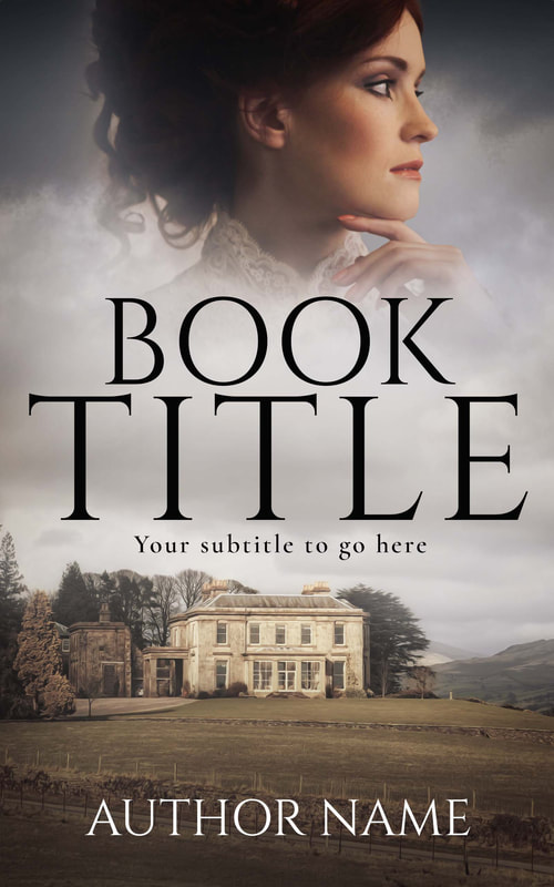
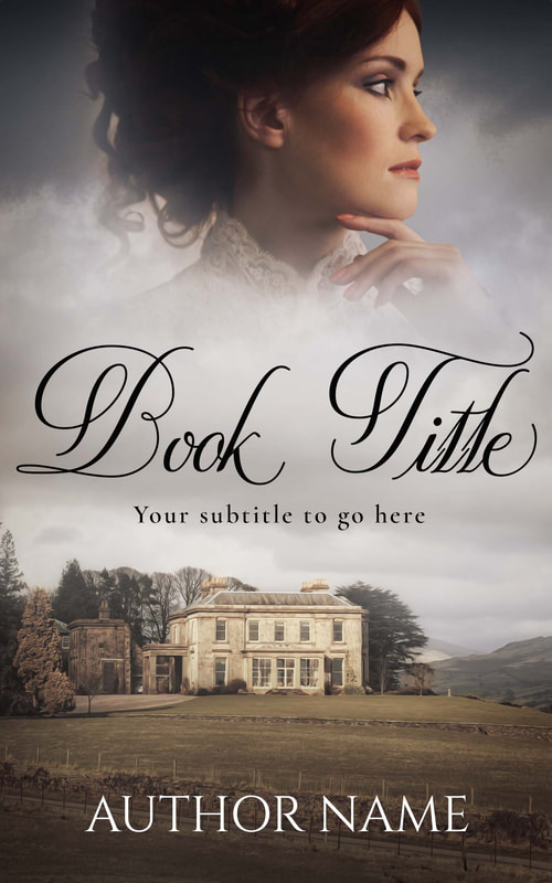
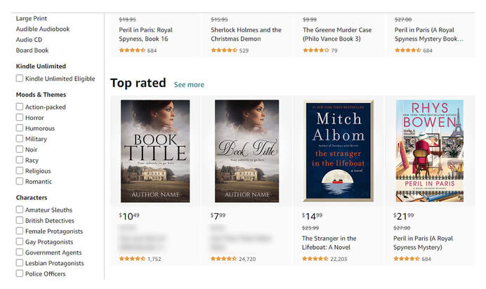
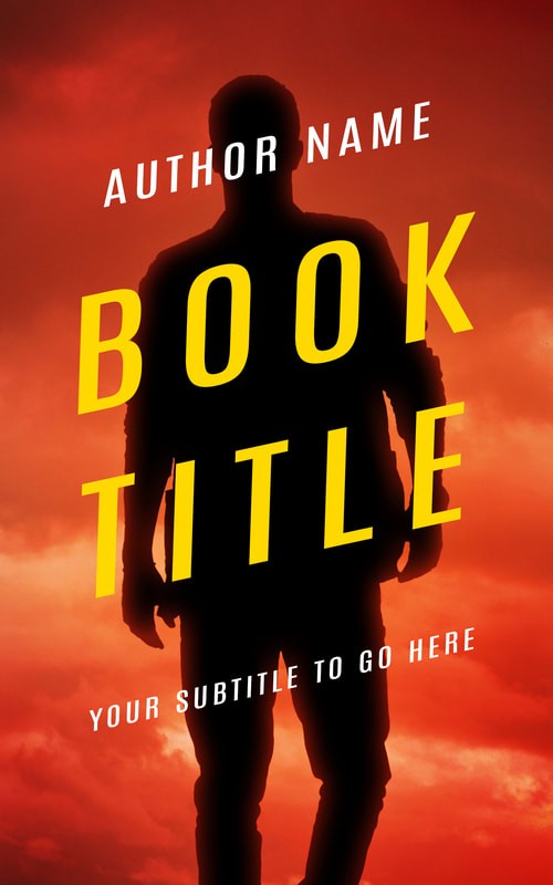
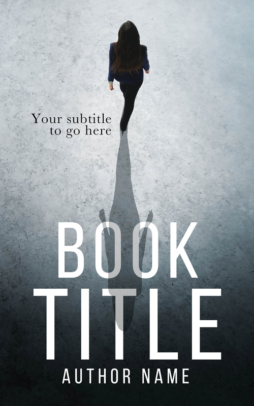
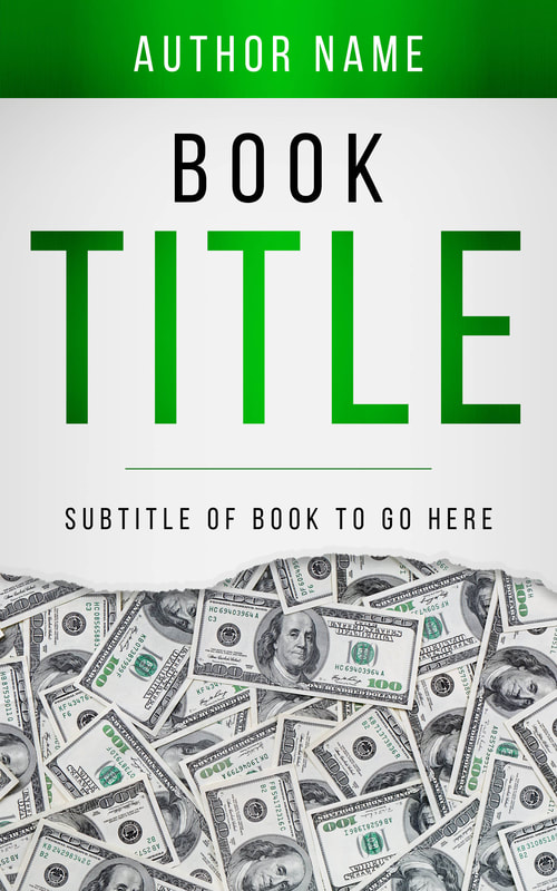
And if you are publishing in multiple places (other than just Kindle) you will need to take the size of the book cover into consideration, if you look at the dimensions for Kindle in comparison to Lulu, this is quite an obvious difference between the two (see the images below). Resolution and color profile Another element to consider will be the resolution of the image/design and the color profile, the resolution of most screens will be at 72 dpi (dots per inch), your book cover for print will be higher than this with most printers requiring a minimum of 300 dpi. Most eBook publishers will require a min of 72 – 150 dpi for your eBook cover, although some will only specify a maximum file size (KDP/Kindle being no greater than 50mb, so a dpi of 300 is fine). The color profile for eBooks is RGB, this is the most common profile for digital images and what your standard JPEGs are normally saved/created as (the alternative to this is CMYK, which is used within printing and what your paperback/hardback will normally be created in). Fonts and their sizes An area which can be overlooked with regards to the eBook cover is font choice, the font you use for your book cover will set the tone and tell the viewer immediately what type of book this is. You will also need to ensure that whichever font you select, that it can be easily read when your book is uploaded to the online bookstore, it’s here where the eBook cover will be shrunk down to a small JPEG, so font choice is important for this, remember, even though it may look great upon the paperback, it may not be that visible on your eBook. If you look at the examples below, you’ll see the same book cover but with different options for font choice and layout, even though the artwork stays the same, the feel and expectation for the book changes a great deal with a different font. You also need to consider how the font will read when the book is uploaded to the online store, look at the examples below to see how visible the same cover is with two different fonts, the second script font would be great for print, but with the eBook it is a little harder to view (at a glance). The subtitles will always be a little harder to read, but your main goal is to get them to see the art, then the title, then click to find out more, it’s at this point the subtitle will be the next hook to make them want to read the book’s blurb/synopsis and then purchase it. Below are more examples of bold book designs for eBooks which capture the eye and work well with their fonts and layout. Creating an eBook cover should take thought and planning, as the majority of books are bought online these days, it is important to ensure that your book’s thumbnail looks professional and is capable of selling your book to a reader.
0 Comments
Your comment will be posted after it is approved.
Leave a Reply. |
JD&JCategories
All
Archives
July 2024
All information within this website (including its blog) is published in good faith and for general information purposes only. JD&J Design LLC does not make any warranties about the reliability and accuracy of this information. Any action you take upon the information in this website is strictly at your own risk. JD&J Design LLC is not liable for any losses and/or damages in connection with the use of this site and information.
|


