|
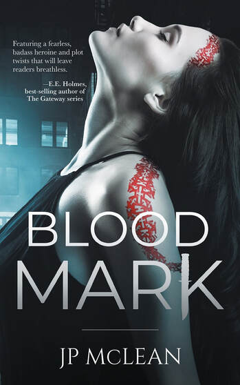
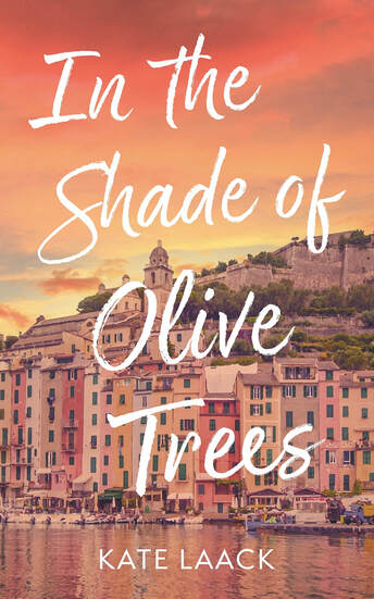
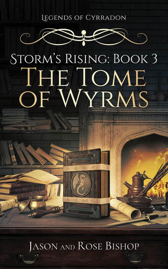
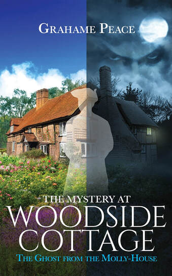
We have all heard the old saying not to judge a book by its cover, meaning not to take things at face value, and try to look a little deeper, the only trouble with this is that we’re subconsciously predisposed to make quick decisions based on how something looks. This is something that we have kept within our subconscious minds for millennia, and as such, we all make assumptions about a person or product based on looks all the time. From this, the world of advertising has developed and pushed boundaries to ensure that what you look at when you walk into a store has the best chance of grabbing your attention, this goes for the online stores too. Now, you may say ‘well advertising doesn’t work on me’ and if that truly is the case, that’s great, however, it does work on lots of other people, and if you want to give your book the best chance of being considered by a potential reader, then you should think about the design you choose for your book. One very powerful thing to remember is if your book cover looks unprofessional, it makes the viewer think that the book’s interior is just as unprofessional, so why would they want to read it? A book cover design has the job of grabbing the eye of the customer, telling them a little about the book and hooking them to want to find out more, it needs to be specific to the genre, format and be capable of working in both print and eBook, oh, and it needs to do this within a fraction of a second too, not much to ask!! What’s more, print on demand publishing has opened a level playing field for authors, you can sell your own book on Amazon alongside the likes of Stephen King and J.K. Rowling, and these authors will not take chances with their book covers. So, with this said, here are five of our favorite book cover designs and why we think they work. One – Blood Mark This is a fiction thriller book by the author JP McCLean, the main focal point of the design is the female character, head tilted back, and eyes closed, the lower section of the cover is dark which helps to pull the eye upwards to the main title, and then the woman. The color theme is almost monochrome, this ensures that the red markings upon her shoulder and face really grab the eye, the shade and light also ensure that the copy is clear to read, the choice of font is bold, simplistic with a slight gradient applied, it’s clear to read and lets the reader know that this is a thriller. Two – In the Shade of Olive Trees A fiction novel in the romantic and self-discovery women’s lit genres by the author Kate Laack. The cover uses warm tones and a location from the book itself, we have the morning sunrise to hint a new and better beginnings with a Mediterranean scene of a fishing village and harbor. The font takes up the majority of the book’s front page, using a script/handwritten style, this is a softer way to display the title and helps to let the reader be aware of the style of fiction within its pages. Three – Tome of Wyrms A fantasy fiction from the authors Jason and Rose Bishop (part of the Storm’s Rising Series). This book cover design clearly sets the scene, location, and genre of book very clearly to the reader, the main focal point (as the title indicates) is the book, this is prominent within the center of the cover and stands out to the viewer. The scene that the book is placed within shows that this novel is set within the fantasy genre, and this is also further highlighted by the style of font along with its gold finish and ornate flourish breaking up some of the copy at the top of the page. Four – How About You? A non-fiction book from the psychotherapist/author Karen Caffery. The book is a collection of questions to ask yourself in order to help you live your best life. The cover puts you (the reader) in the chair of the psychotherapist, the pad on the seat indicates the note taking and question asking, it’s also linked to the word YOU within the title by being the same color, again, putting YOU in the seat and asking the questions. The font and layout of the design are both clear and bold, using clean space and a clear focal point, it tells the readers that the book is accessible, professional and will help with their own self-help journey. Five – The Mystery at Woodside Cottage A fiction novel by the author Graham Peace, this is part of a larger series of books from the author and is a historical mystery series appealing to readers of period detective, ghost stories and cozy mysteries too. The cover is split into two sections, with the main character of the book (the Ghost) as a central focal point, the background of the cover design features an English country cottage, one side is beautiful and in bright sunlight, the other is at night, with a full moon, clouds, and the building looking far more sinister, this highlights the contrast between the first impression the reader is given (within the story) of the location and story, then as the book goes on, the darker elements to it (going from light to dark and left to right within the design). The design is still bright and uses rich colors upon both sides, it lets the reader know that this is not a hardcore slasher book, but a cozy period thriller/ghost story. The title uses a genre reflecting serif font and gives clear contrast upon the background.
0 Comments
Your comment will be posted after it is approved.
Leave a Reply. |
JD&JCategories
All
Archives
July 2024
All information within this website (including its blog) is published in good faith and for general information purposes only. JD&J Design LLC does not make any warranties about the reliability and accuracy of this information. Any action you take upon the information in this website is strictly at your own risk. JD&J Design LLC is not liable for any losses and/or damages in connection with the use of this site and information.
|


